Join The (solarized) Light Side!
public void greet() {
    System.out.println("Hello from Solarized!");
}
You may have noticed that this website has a light amber background that (hopefully!) makes it easier on the eyes. Or, perhaps you didn’t even notice at all, because you’re using software like flux to warm your screen colors and the website looks like everything else on your screen. And then, maybe you did in fact notice, and found it annoying a site would use anything other than white as a background color. So, no matter where you come from, I’d like to take a minute and talk about Solarized Light, the color scheme that I use for pretty much everything, and explain why I chose #fff6e5 instead of #ffffff.
What is it?
Solarized is a color scheme for code syntax highlighting, and is one of the most popular color schemes today. The creator, Ethan Schoonover, spent six months designing the palette, using color wheel and lightness relationships to choose the sixteen colors that form the Solarized Light and Solarized Dark schemes. Solarized is present everywhere, from terminal emulators to text editors, IDEs, and even keyboards.
Why join the light side?
So sure, Solarized is very popular, and plenty of people use it. But why do I use the Light color scheme, or any dark on light color scheme at all?
This subject is a source of great contention, and one very much based on personal preference, or even on how different people perceive color. I’d like to talk about why I choose the light side over joining the dark side: (besides Yoda, of course!)
-
Easy to read, easy on the eyes
// update the location
let geoCoder = CLGeocoder()
geoCoder.reverseGeocodeLocation(location) { (placemarks, error) in
    let placeMark = placemarks?[0]
    if let city = placeMark!.addressDictionary!["City"] as? NSString,
        country = placeMark!.addressDictionary!["Country"] as? NSString {
            dispatch_async(dispatch_get_main_queue()) {
                self.locationLabel.text = "\(city), \(country)"
            }
    }
}
Now, I will admit that most light (dark text on light background) color schemes are quite bright and tiring, especially those with solid white backgrounds. However, I find Solarized Light very easy to read: its look and feel resembles that of an old book under an incandescent bulb, or that of a Kindle underneath the shade. The soft yellow background and lighter text colors help decrease sharp contrast but still keep text clear. The accent colors (red, blue, green) are some of my favorites in the palette: they’re colorful and clear, yet subdued and balanced compared to the more monotone colors.
-
Many others joined the Light

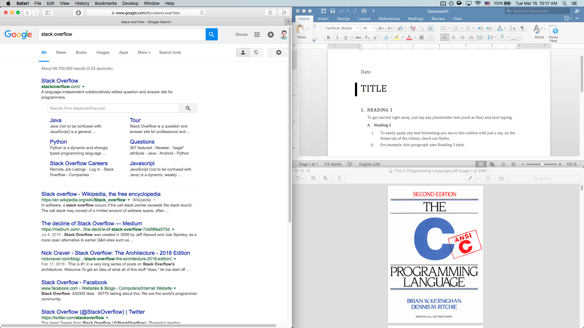
Peer pressure, man! A vast majority of websites and applications have black text on a white background. Google, Office, and PDF documents are all squarely in the dark on light category: in fact, it would be much easier to list out apps with dark palettes, because there are so many fewer of them.

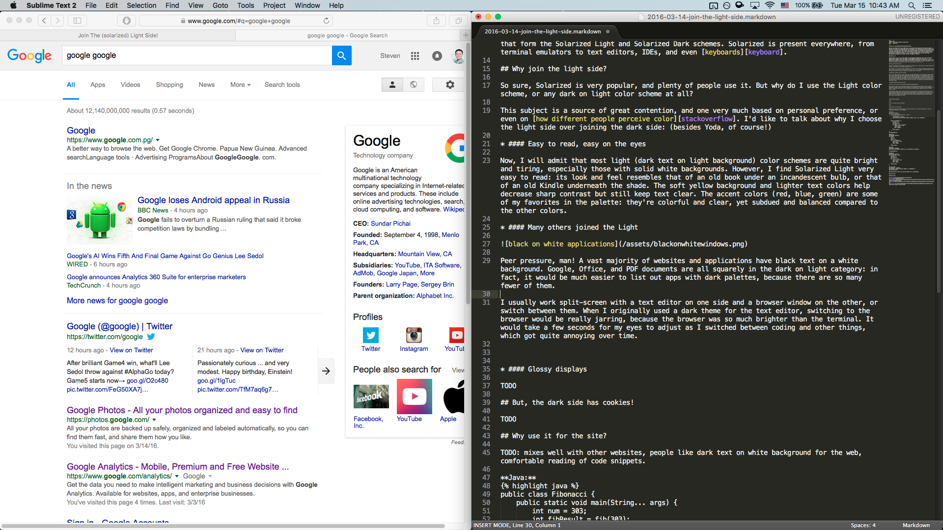
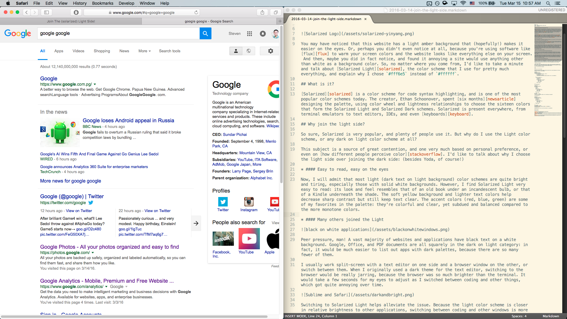
I usually work split-screen with a text editor on one side and a browser window on the other, or switch between them. When I originally used a dark theme for the text editor, switching to the browser would be really jarring, because the browser was so much brighter than the terminal. It would take a few seconds for my eyes to adjust as I switched between coding and other things, which got quite annoying over time.

Switching to Solarized Light helps alleviate the issue. Because the light color scheme is closer in relative brightness to other applications, switching between coding and other windows is more comfortable and less jarring. Additionally, you can now set the monitor brightness to a constant level, where both your code and everything else looks equally good: with a dark color scheme, sometimes the dark text editor can look, well, dark, while webpages may look too bright.
-
Glossy displays
Glossy displays have recently become the norm. Apple no longer even makes any computers with matte displays, Windows laptops are shifting to glossy displays due to the addition of touch, and all popular smartphones and tablets have glossy glass surfaces.
Glossy displays have vivid colors and deep blacks, but their biggest flaw is their reflectiveness. The reflections can be obtrusive and tiring on the eyes, and have resulted in many people (especially professionals and developers) preferring matte displays. However, how much a glossy display reflects depends on the content that it’s showing: dark colors are very reflective because they are not very bright, and light colors result in almost no reflections at all.
I have found that Solarized Light works very well on glossy displays, because its light background reduces glare, even when brightness is turned down. One of the more common complaints of Solarized is its lighter contrast between text and background compared to other color schemes: this is usually not a problem with modern IPS displays, because accurate colors usually result in a very clear Solarized look. With older TN panels with more washed out colors, Solarized can be harder to read: then, another color scheme may be a better choice.
But, the dark side has cookies!

Please don’t get me wrong: dark color schemes are also great in different situations. Light text on a dark background works very well for matte displays, where anti-glare coatings prevent harsh reflections. If you like to use a lower brightness, a dark color scheme may likely be easier to read than a light one. And, if you mostly code in a dark room and/or at night, a dark theme may fit in better with the surroundings and be less obtrusive. Finally, many (in fact, a majority!) of people just prefer dark color schemes and enjoy using them every day. So, by all means, use whatever you’re most comfortable with!
Why use it for the site?
Pretty simple: most popular sites have black text on a light background, and I wanted this site to mix well with the others. Also, I use Solarized Light for all my development, so why not carry over some of that to the site? I chose to only use the yellow background, and to not also change the foreground text to grey, because that would likely be too hard to read for some.
One cool thing is that code snippets fit in beautifully with the site! Here are some examples:
Java:
public class Fibonacci {
    public static void main(String... args) {
        int num = 30;
        int fibResult = fib(num);
        System.out.printf("The %dth Fibonacci number is %d.", num, fibResult);
    }

    public static int fib(int n) {
        int prev = 0;
        int curr = 1;
        int result = 0;
        for (int i = 1; i < n; i++) {
            result = prev + curr;
            prev = curr;
            curr = result;
        }
        return result;
    }
}
Python:
def fib(n):
    prev = 0
    curr = 1
    result = 0
    for _ in range(1, n):
        result = prev + curr
        prev = curr
        curr = result
    return result

num = 30
fib_number = fib(num)
print("The {}th Fibonacci number is {}.".format(num, fib_number))
Swift:
func fib(n: Int) -> Int {
    var prev = 0
    var curr = 1
    var result = 0
    for _ in 1 ..< n {
        result = prev + curr
        prev = curr
        curr = result
    }
    return result
}

let num = 30
let fibNumber = fib(num)
print("The \(num)th Fibonacci number is \(fibNumber).")
As you can see, there’s no need to change the background for code blocks, because it’s already Solarized!
Try it out!
If you’d like to try out Solarized, here’s where you can get it:
-
Sublime Text has a built-in Solarized color scheme!
-
Solarized contains formats for Vim, IntelliJ, Visual Studio, and many popular terminal emulators.
-
Xcode Theme: tested working with Xcode 7.